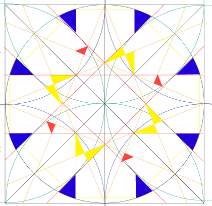
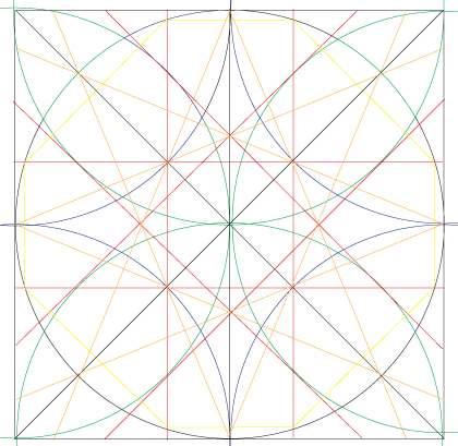
In order to respect the moroccan identity of the studio, I have worked on a typical islamic construction grid, usualy used for mosaic. I have been able to elaborate a logo and also a graphic pattern.
The color code using blue, magenta and yellow refers to the printing services offered by AD Pub. The blue dominant color echoes to the color of the city Essaouira, where is based the agency.
Islamic construction grid
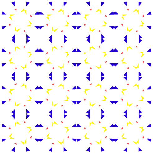
A pattern offers a modern and dynamic presentation on differents media. It fits for the moroccan idendity of the studio.
Pattern construction

Three geometric shapes are extracted from the pattern and become identifiable graphic elements.
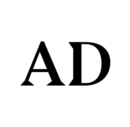
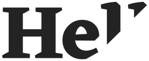
Bluu Next Bold :
The triangular shape of this font matches the geometric forms of the visual identity.
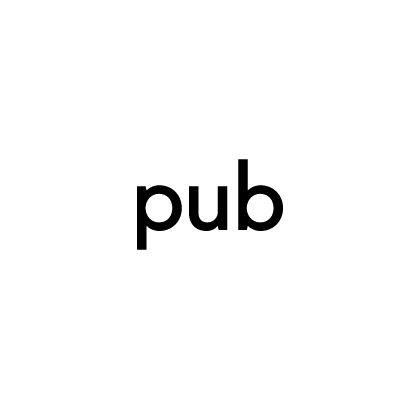
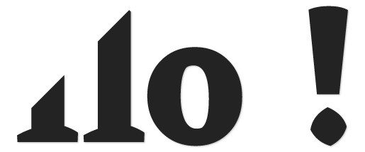
Fugue Regular :
A modern round typo balances the pointed shapes of the geometric elements and the Bluu Next font.
Graphic elements and typographies
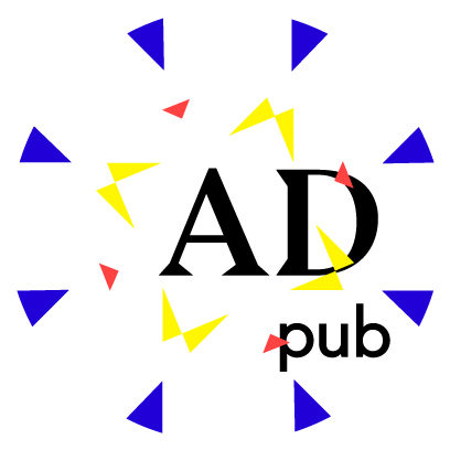
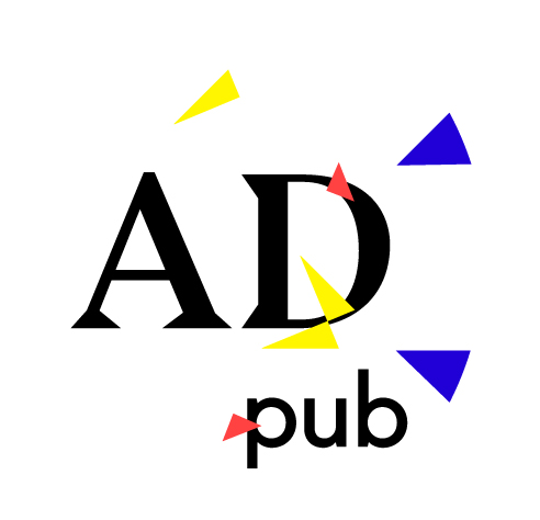
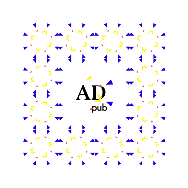
For the logo, I deleted some elements of the pattern in order to bring dynamism and movement while keeping the balance brought by the grid. Thus, we have a modern logo that fits for the moroccan identity of the studio AD Pub.
Logo construction
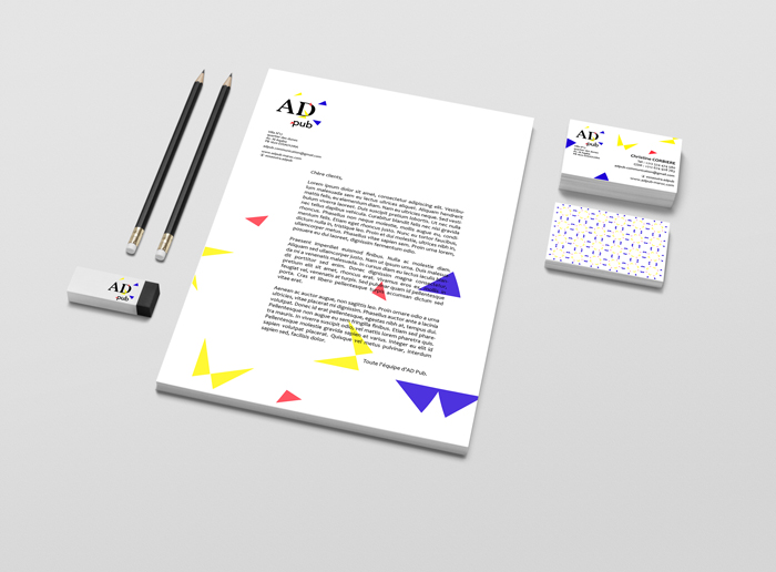
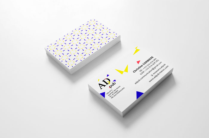
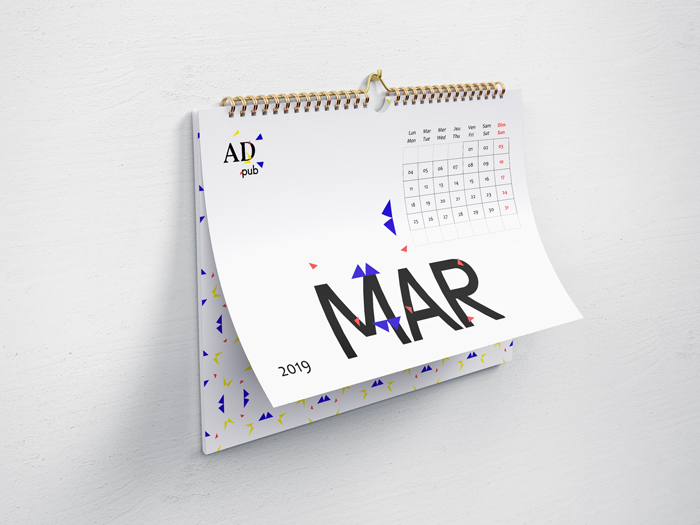
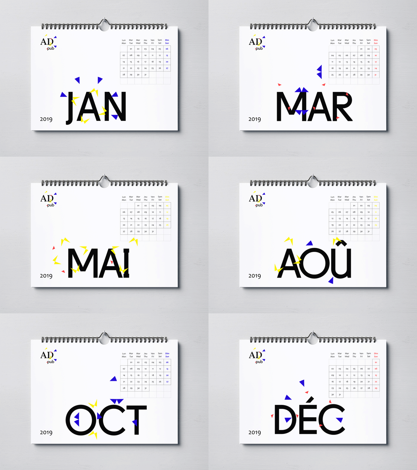
The pattern allows us to develop the visual identity on a lot of media, playing with its construction. The brand remains identifiable. The full pattern is used as a background.
Printed media

