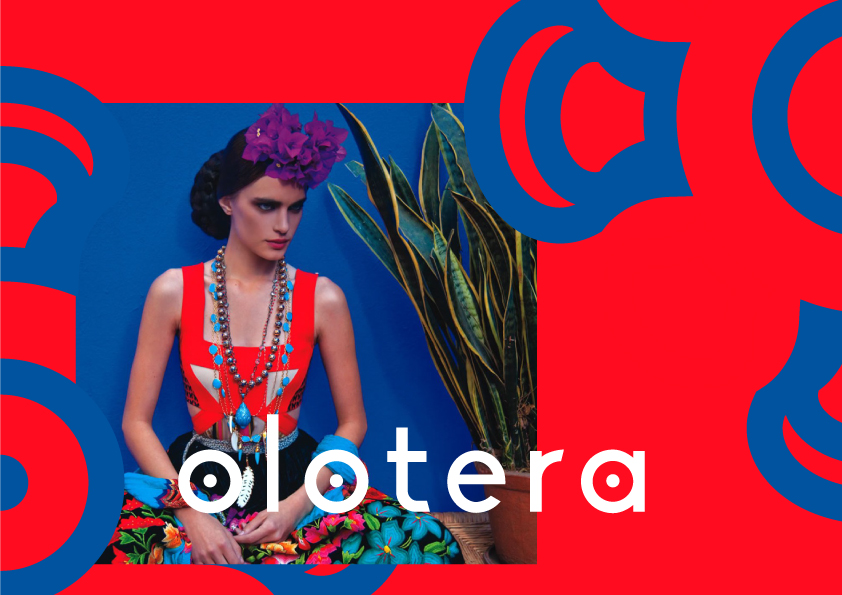
The olotera is a tool made from the hearts of corncobs and is used to remove other corncobs.
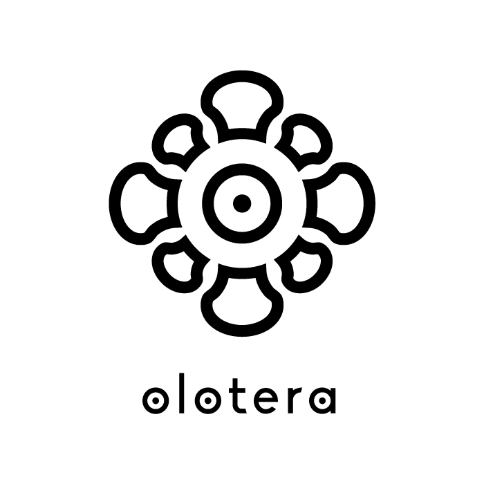
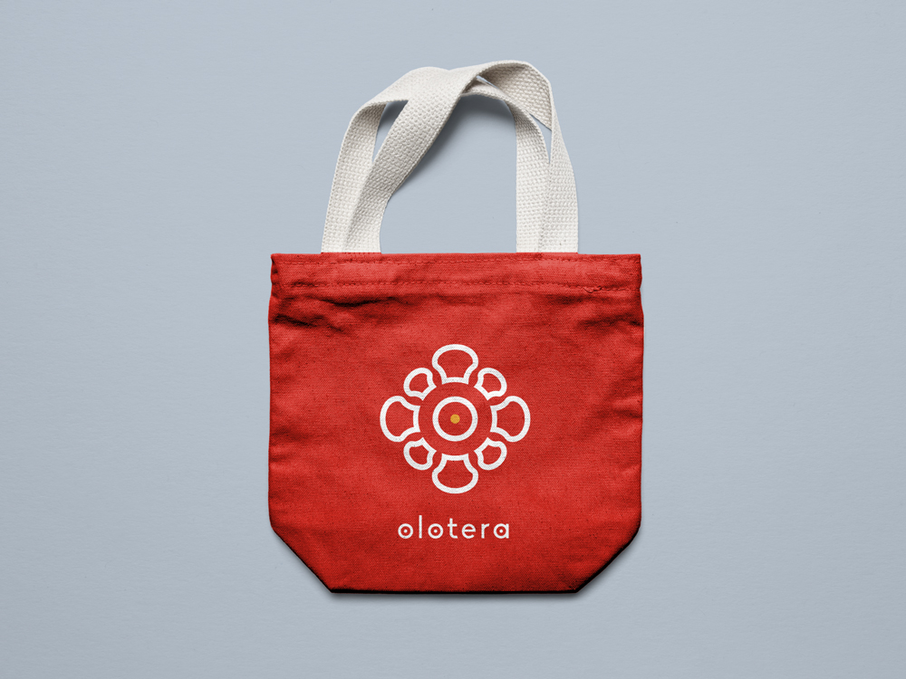
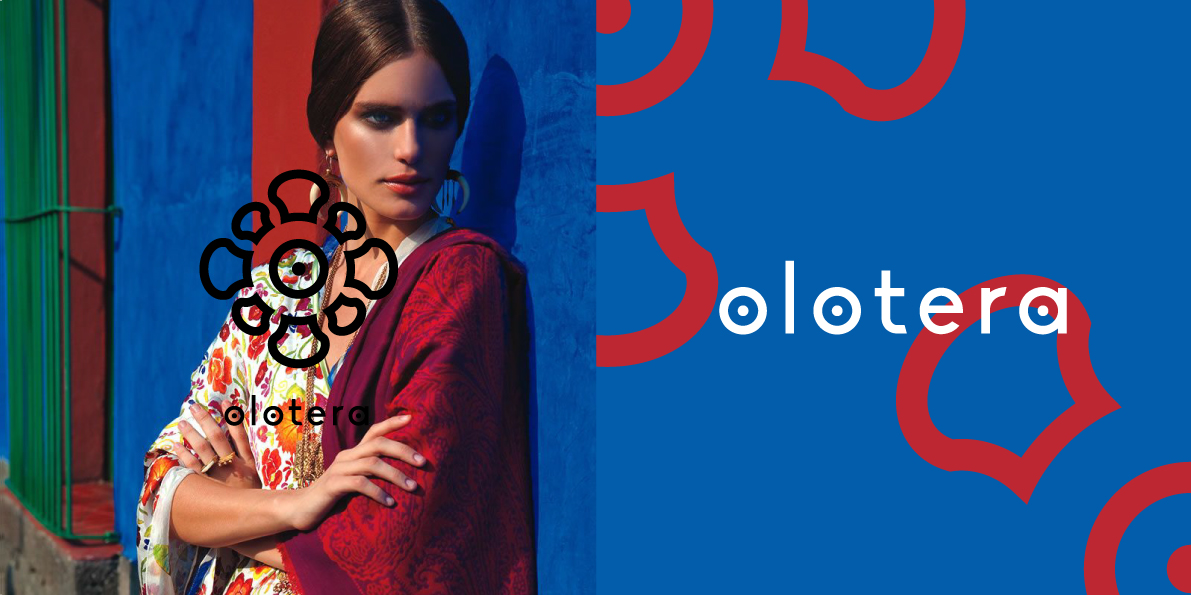
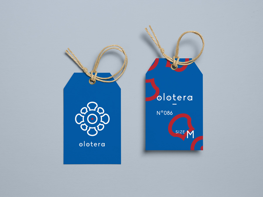
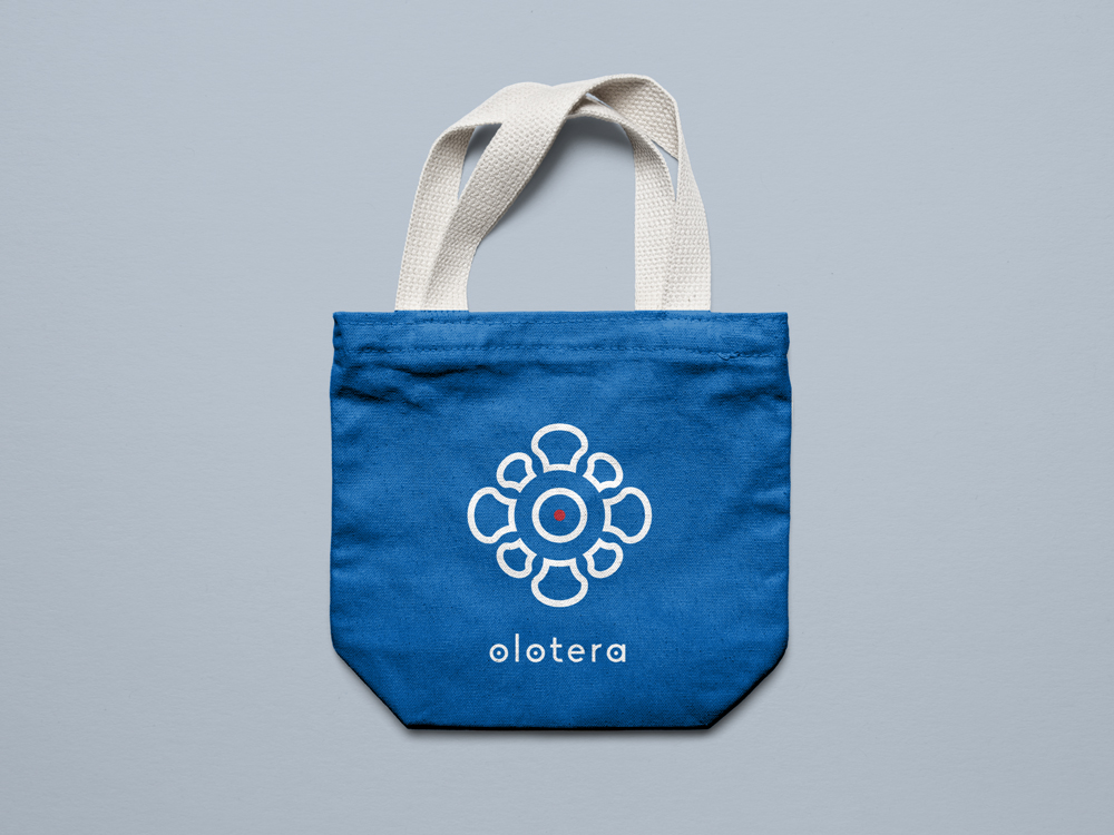
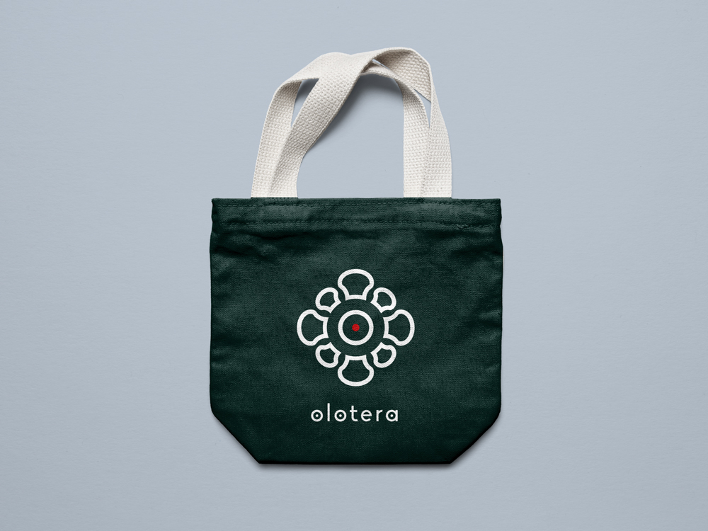
The iconographic logo is inspired by this traditional object, using a stylized shape of corn.
These latter, each representing a unique know-how, come together to form a circle, an alliance gravitating around the nerve center that is the Olotera brand.
A iconographic logo
The Biko typography was chosen for its friendly character and its roundness. It allows the letters "o" and "a" to take up the heart of the logo - the point inside the circle - in order to create graphic continuity. It can be used alone if necessary.
The typography
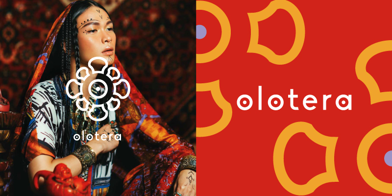
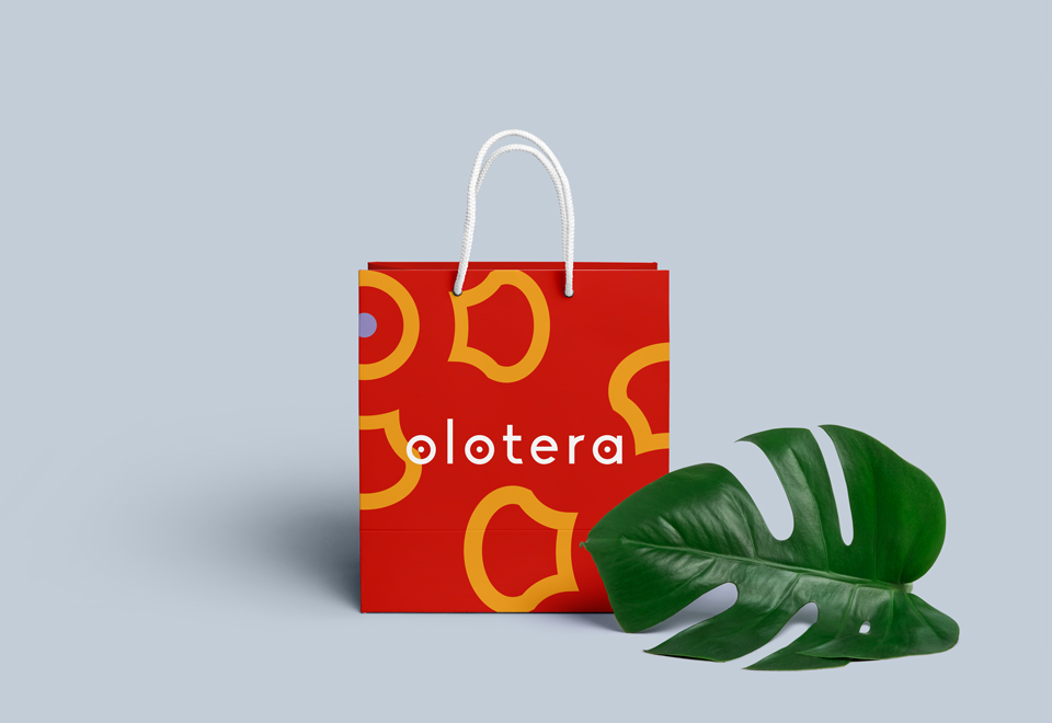
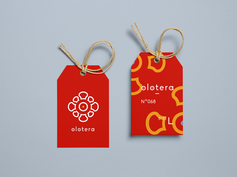
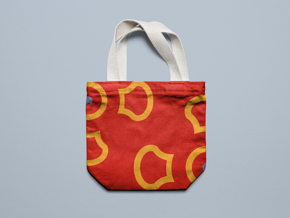
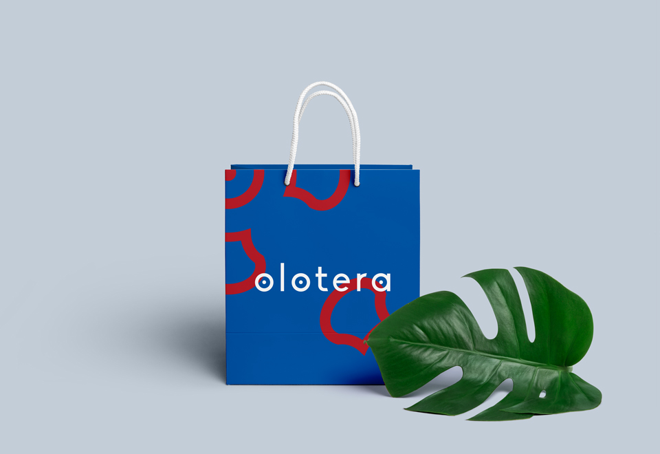
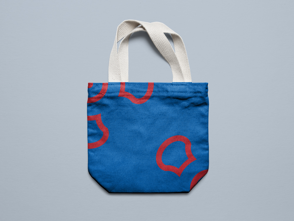
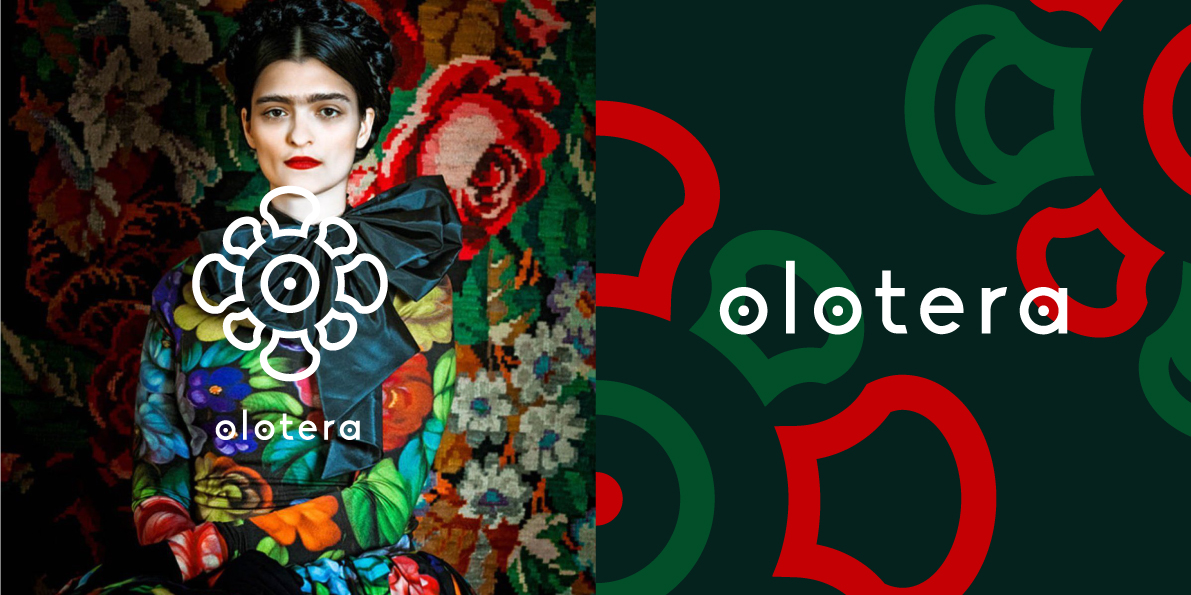
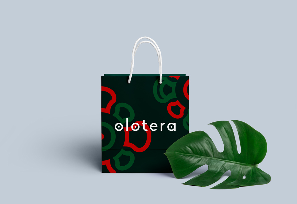
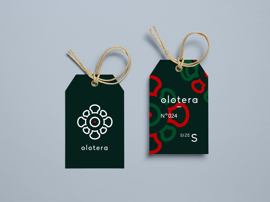
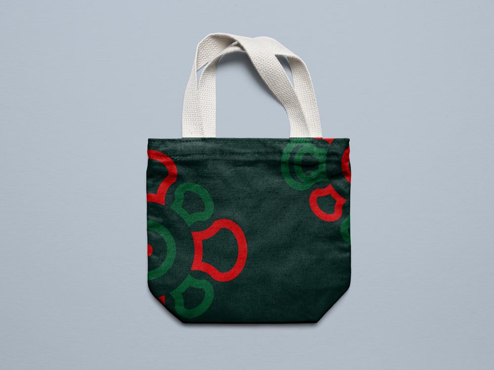
Patterns are created by deleting or multiplicating the elements of the logo and exist in different color ranges inspired by Latin America.
The visual identity is developed on multiple supports according to the collections and collaborations of the brand.
A visual identity developed in collections
A visual identity developed in collections
A visual identity developed in collections


